
Color theory introduction
Why do graphic designers select colors? First, they researched the emotions they wanted their design to evoke before deciding on the primary color. However, they also need to choose additional colors for their design. They pick colors using the Color Wheel Theory because not all color combinations complement each other, and knowing how colors interact is crucial.
The study of color theory focuses on how different hues work together, interact, and harmonize. It covers the ideas and theories that underlie how colors are perceived visually and their psychological and emotional impacts. Color theory is essential in many fields, including art, graphic design, psychology, marketing, and aesthetics.
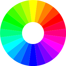
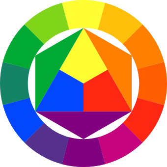
The concept of the color wheel, which arranges colors according to their connections, is at the heart of color theory. Red, blue, and yellow are the fundamental colors on the color wheel. The secondary colors are –Orange, green, and purple. Tertiary colors are produced by combining primary and secondary colors. Additionally, color temperature, value, saturation, and the psychological effects of various colors are also examined by color theory. The theory has become a base for graphic designers to pick the right colors, even for social media design to convey what the social media account is all about
Color harmony is one of the foundational tenets of color theory. It entails the expert selection and blending of colors to produce aesthetically attractive and harmonious compositions. The effects and emotions produced by various color harmonies, including monochromatic, analogous, complementary, and triadic, vary.
Understanding how colors may elicit feelings, shape perceptions, and convey messages is today possible thanks to color theory. Cool colors like blue and green can express tranquility, peacefulness, and stability, whereas bright colors like red and orange frequently represent energy, passion, and warmth. Cultural and individual connotations also influence color meaning and interpretation.
Graphic Designers may use colors to enhance aesthetics, generate visual impact, and elicit specific responses from the audience by having a solid grasp of color theory. Thanks to it, they may choose color schemes that go with the desired tone, goal, and message of their work. Additionally, color theory offers a shared vocabulary for discussing and analyzing colors, promoting successful communication and teamwork in creative industries. We can say that a thorough knowledge of color theory is essential to studying graphic design today.
What are Primary Colors?
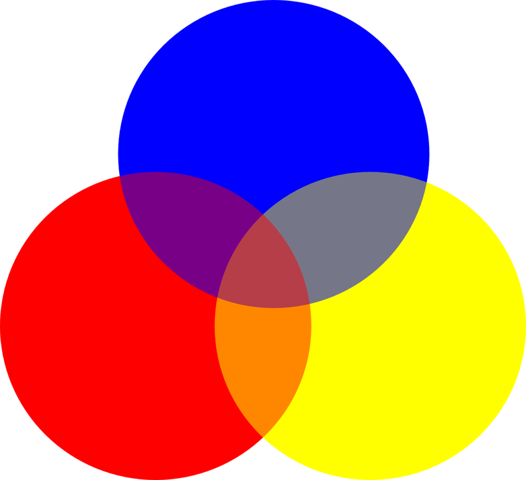
You need to think of primary colors as parent colors since they are the basis for all other colors and are referred to as prime colors. These colors are red, yellow, and blue. You cannot make primary colors by mixing any two colors.
What are Secondary Colors?
The three secondary colors are orange, blue, and green. Secondary colors are those produced by mixing two primary colors, which can be red, yellow, or blue. You should keep in mind that secondary colors are formed with the hue of each primary color.
Here is how to combine primary colors to create secondary colors.
- Red + Yellow = Orange
- Blue + Red = Purple
- Yellow + Blue = Green
What are tertiary colors?
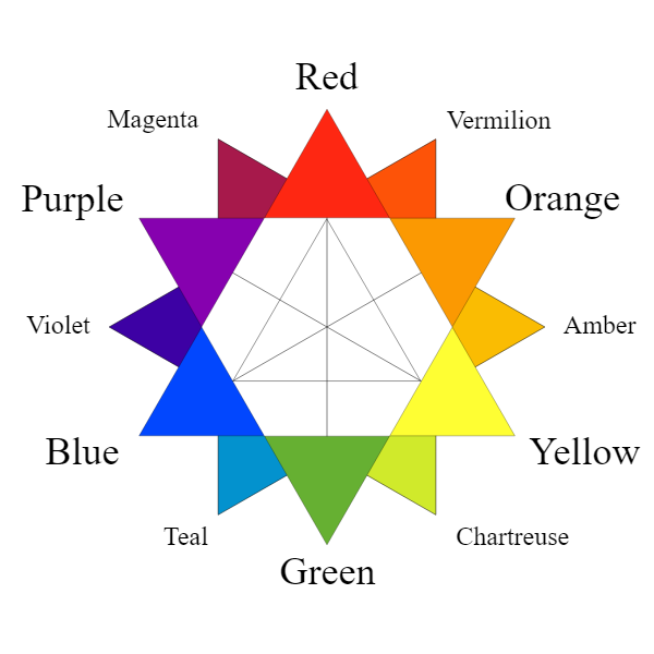
Between primary and secondary hues, tertiary hues are a crucial component of the color wheel. These tones are produced by combining complementary primary and secondary colors in an exact ratio.
The six tertiary hues are:
- Magenta (red-purple).
- Vermilion (red-orange).
- Amber (orange-yellow).
- Chartreuse (yellow-green).
- Teal (blue-green).
- Violet (purple-blue).
For graphic designers, painters, and anyone who uses color, tertiary hues open up a world of possibilities. They offer adaptability and subtlety, making it possible to create elaborate color combinations. Tertiary hues bridge the chasm between warm and cold tones in compositions by combining primary and secondary colors.
Here is how to combine colors to achieve tertiary colors :
- Red + Orange = Red-Orange (vermillion)
- Red + Purple = Red-Purple (magenta)
- Blue + Green = Blue-Green (teal)
- Blue + Purple = Blue-Purple (violet)
- Yellow + Orange = Yellow-Orange (amber)
- Yellow + Green = Yellow-Green (chartreuse)
What is a Color Wheel?
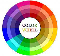
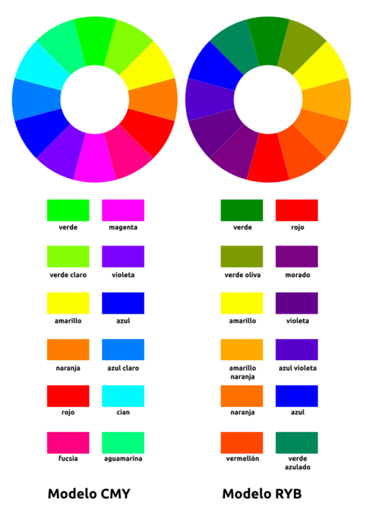
The connections between colors are shown visually through the color wheel. The wheel has colors arranged in a circle according to their primary, secondary, and tertiary associations. The three primary colors on the wheel—red, blue, and yellow—are evenly spaced apart. Orange, green, and purple are secondary colors. These are made by combining complementary primary colors in an exact ratio.
After that, combining complementary primary and secondary colors in equal proportions gives us tertiary colors. Color Wheel makes understanding color harmony, complementary colors, and color connections much easier for graphic designers and artists. It is a helpful tool for producing visual balance and pleasant color combinations in various creative endeavors.
Hue
Hue, which represents a color’s truest and most distinct form, is its fundamental characteristic. Colors like red, blue, and yellow are examples of hues. The basic components of the color wheel, hues, form the foundation for color combinations and palettes.
Shade
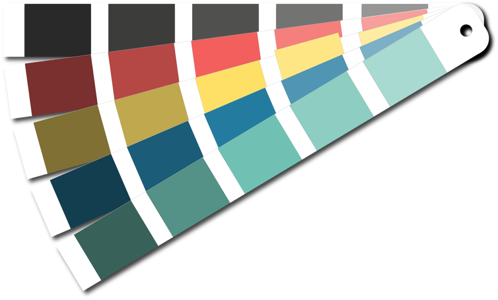
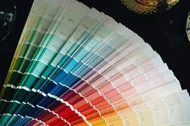
The deeper variations of color are known as shade. You get them by blending in black, which deepens and intensifies the original color. In art or design, shades frequently evoke a sense of intrigue, drama, or intensity. Designers frequently utilize them in graphic design art for shading, casting shadows, and enhancing contrast, and they may give compositions more depth and dimension.
Tint
Tint: Tint describes a hue’s paler iterations. You can have it by mixing white with the primary hue to produce a softer, pastel-like tone. Tints have a delicate, airy aspect that makes people feel light, clean, and innocent. Tints find their use for creating a soft, feminine style, including nursery spaces or works of art with a springtime theme.

Tone
The desaturated or subdued variations of color are referred to as tones. The designers add gray to reduce the original color’s brightness and intensity. Tones have a more muted, nuanced character that conveys elegance and nuance. They usually appear in graphic designs that require a restrained and well-balanced color scheme.
Tones may provide compositions depth and complexity to create a harmonious and opulent visual experience,
What are Color Models (CMYK RGB)?
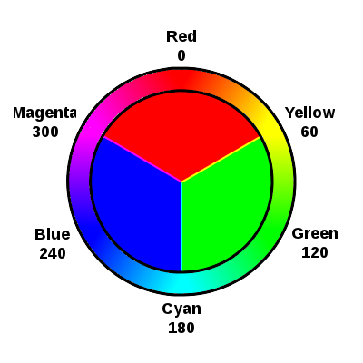
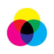
CMYK and RCB are color models that represent and organize colors digitally. Color models, respectively. The printing process known as CMYK, which stands for Cyan, Magenta, Yellow, and Key/Black, combines these four ink colors to create a variety of hues.
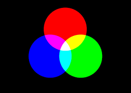
A digital design and display employ RGB, which stands for Red, Green, and Blue, combining different red, green, and blue light intensities to produce a range of colors. While electrical equipment like monitors, TVs, and cameras utilize the RGB model as the norm, physical surfaces are reproduced with colors using the CMYK model. Understanding these color models makes it possible to regulate color precisely and consistently in the graphic design and printing processes.
What is RGB Color Model?
On electrical devices like monitors, TVs, and digital displays, the RGB color model is a technique used to represent and show colors. Red, Green, and Blue are the three basic colors of light, and their abbreviation is RGB.
Red, green, and blue light are combined in different intensities to form colors in this model. Intensity levels for each color channel can range from 0 to 255, with 0 denoting no intensity and 255 denoting maximum intensity. Numerous hues may be created by mixing these primary colors at various intensities.
The RGB color model is crucial for digital design, photography, and any other media that depends on electronic displays for color representation.
What is CMYK Color Model?
CMYK stands for the colors Cyan, Magenta, Yellow, and Key/Black. It is a subtractive color scheme mostly used in printing as a CMYK color model. In this concept, you produce colors by adjusting the quantity of these four ink colors over white ground. Each color indicates the wavelengths of light absorbed. When all the colors get combined, they become dark. Where white light gets absorbed by the ink layers in tangible materials like paper or cloth,
CMYK replicates colors on physical surfaces like paper or cloth, where ink layers absorb white light. The Key/Black channel is for the use of increasing contrast and detail.
In the printing business, CMYK is essential because it guarantees precise color and reproduction. It also offers a standardized process for producing vivid and detailed printed products.
What is Color Harmony
The harmonious placement and blending of colors in a design or piece of art is referred to as color harmony. Designers should carefully select and balance colors to produce a harmonious and aesthetically pleasing composition. They create color harmonies in a piece of graphic design using different methods. These include complementary colors, analogous colors, and triadic colors. On the color wheel, complementary colors are the ones placed next to each other, analogous colors are the ones next to each other, and triadic colors are three evenly spaced colors.
Harmonious color combinations may generate a range of emotions and settings, from quiet and relaxing to energizing and exuberant. Visual designers and artists can produce visually appealing and aesthetically satisfying creations by understanding color connections and harmonies.
Monochromatic
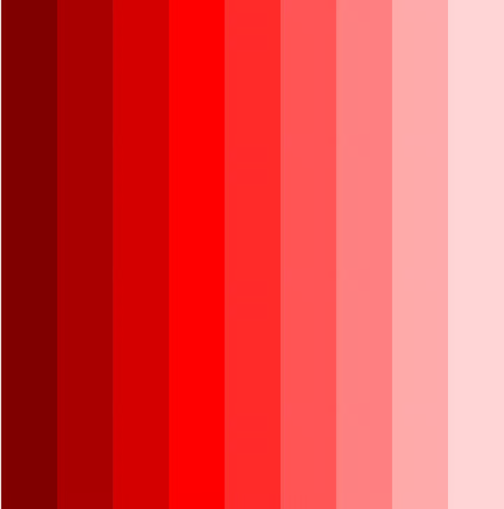
A monochromatic color scheme uses several tints, hues, and tones of a single color. While offering minor changes in value and intensity, it produces a harmonious and unified aesthetic.
Analogous
On the color wheel, analogous colors are those close to one another. This color combination fosters visual harmony and fluidity. It provides a pleasing mix while allowing for small color and saturation fluctuations.
Complementary
Complementary colors are duos of hues situated next to one another on the color wheel. This color combination produces a striking and dramatic contrast. Complementary colors amplify one another, producing visual impact and eye-catching composition.
Split-Complementary
In a split-complementary color scheme, the complementary color is surrounded by two other colors. It offers a lively yet harmonic composition as a balanced alternative to the stark contrast of complementary colors.

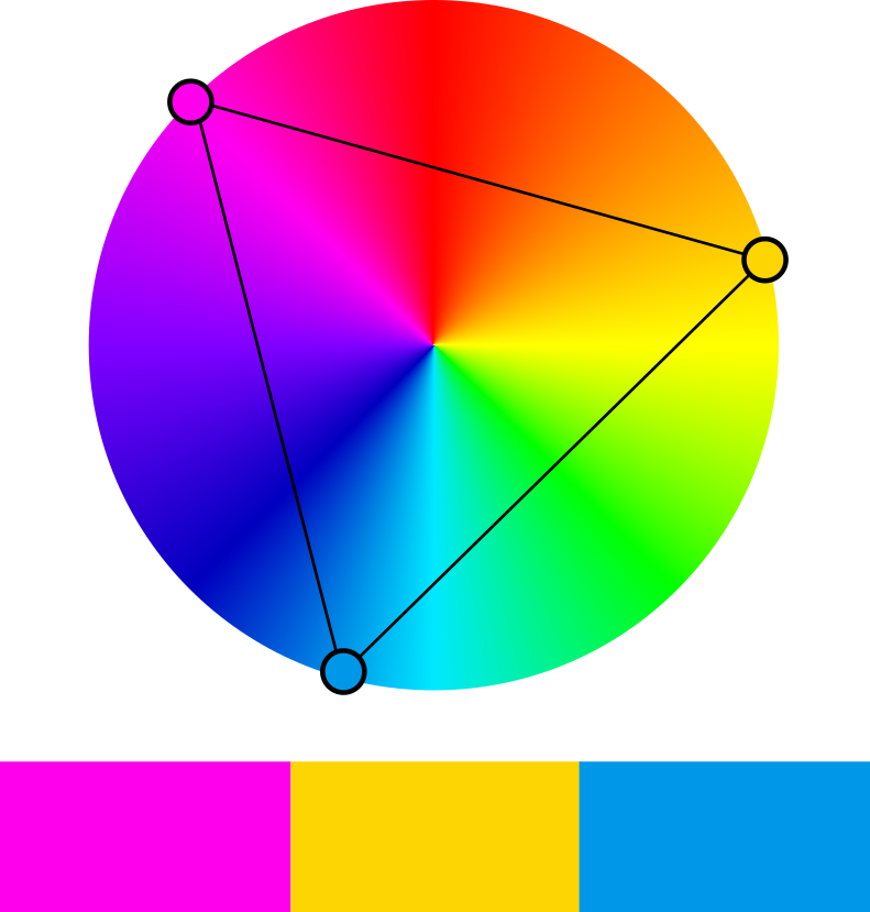
Triadic
Three colors are evenly spaced across the color wheel in a triadic color scheme. It offers a harmonious and well-balanced mix while allowing for color variance. Triadic schemes are flexible and may produce lively and subdued compositions.
What is the meaning of different colors?
It would be useful to know the meaning of different colors before incorporating them into a graphic design piece. All the colors evoke specific emotions, which the designers explore to convey a message and personality.
Here are the precise meanings of different colors:
Red
Red is frequently used to express fervor, vigor, and intensity. It may arouse powerful feelings and stand for courage, strength, and love. As a color that draws attention and is frequently used to convey a sense of urgency or significance, it may also stand for strength and assertiveness. Red is sometimes connected to success and wealth in certain cultures.
Blue
The color blue represents stability, peacefulness, and peace. It is frequently used to add calmness and depth to designs and stands for trust, loyalty, and wisdom. In addition, blue is a well-liked color for business branding because it frequently stands for trust and dependability. It can also inspire tranquility and serenity, making it perfect for encouraging rest or a sense of calm.
Yellow
The happy, upbeat color yellow stands for creativity, optimism, and joy. It may attract attention and exude warmth and enthusiasm. With its vibrant and energetic nature, yellow is known to stimulate creativity and spark innovation. It can create a feeling of warmth and happiness, making it a popular choice for a graphic design aimed at promoting optimism and joy.
Green
The color green stands for peace, progress, and nature. It frequently connotes harmony, newness, and regeneration. Green is a soothing and meditative color that also represents fertility and plenty. Green is frequently used to denote environmental sensitivity and sustainability since it is linked to health and vitality. It is a preferred option for businesses in the natural, health, and wellness sectors since it may inspire sentiments of development and rebirth.
Purple
Purple is associated with aristocracy, wealth, and spirituality. It mixes the vitality of red with the serenity of blue, frequently signifying imagination, mystique, and aspiration. Purple has regal overtones and is frequently associated with mysticism and reflection. It may arouse creativity and imagination, making it suitable for graphic designs, including fine art, fantastical creatures, or high-end goods
Orange
Orange is a fiery and vivacious color for zeal, coziness, and optimism. It is frequently employed to draw attention and instill a sense of liveliness, and it has the potential to evoke sentiments of excitement and amusement. Orange may be used to evoke excitement or enthusiasm while also stimulating hunger. It is a common option for designs intended to encourage social contact or enjoyable experiences since it is frequently connected with warmth and friendliness.
Black
Black is a color that denotes formality, strength, and elegance. It frequently connotes authority, refinement, and mystery. Black may give designs a sense of depth and contrast. Black is also often used to evoke a sense of mystery and elegance, making it a popular choice for luxury and high-end products. It can create a sense of sophistication and timelessness, making it a versatile color in graphic design.
White
White represents simplicity, innocence, and purity. It frequently connotes purity, tranquility, and brightness. White may give designs a feeling of openness and clarity. White is often associated with purity and cleanliness, making it a popular choice for healthcare or hygiene-related designs. It can also symbolize simplicity and minimalism, making it suitable for modern and sleek aesthetics.
Gold
Gold is a color to express riches, luxury, and success. It stands for luxury, prosperity, and extravagance. Gold can give designs a feeling of sophistication and elegance while adding a dash of glitz and richness. It is a popular symbol of achievement and success that denotes distinction and exclusivity and helps evoke a sense of richness and extravagance for high-end companies or celebratory designs.
Gray
Gray is a neutral hue to convey pragmatism, elegance, and subtlety. It stands for harmony, dependability, and serenity. Gray may evoke a feeling of formality and professionalism, making it appropriate for minimalist or business designs. It is frequently used as a backdrop color to bring out the best in other hues or to provide a sleek, contemporary look.
Wrapping Up
Investigating color theory in graphic design is a worthwhile endeavor that may significantly improve the impact and efficacy of visual communication. The principles and ideas of color theory may help graphic designers choose colors, put them together, and create harmonies.
Designers may produce aesthetically beautiful and harmonious compositions by comprehending the color wheel, color connections, and the psychological and emotional consequences of colors. They can do so to build a strong visual identity for businesses and projects, express specific messages, and generate desired emotions.
Exploring color theory also offers a foundation for employing color to build visual balance, construct hierarchy, and direct spectator attention inside designs. The strategic use of color enables designers to transmit meaning, emotion, and ambiance.